Open any financial app or website, and you are immediately greeted by a chaotic jumble of jagged lines, blinking numbers, and a barrage of red and green colors. For a beginner, looking at a stock chart can feel like trying to read an alien language. It is enough to make anyone close the app and immediately give up on investing.
But here is a secret that Wall Street doesn’t want you to know: you do not need a finance degree to understand what a stock chart is telling you.
Here at Wealth Path Daily, our goal is to cut through the jargon. Whether you are actively trying to grow your own retirement stash or, like me, keeping an eye on a five-year-old’s future college fund, knowing how to interpret basic market trends is an essential life skill. You just need to know which few data points actually matter and how to ignore the rest of the noise.
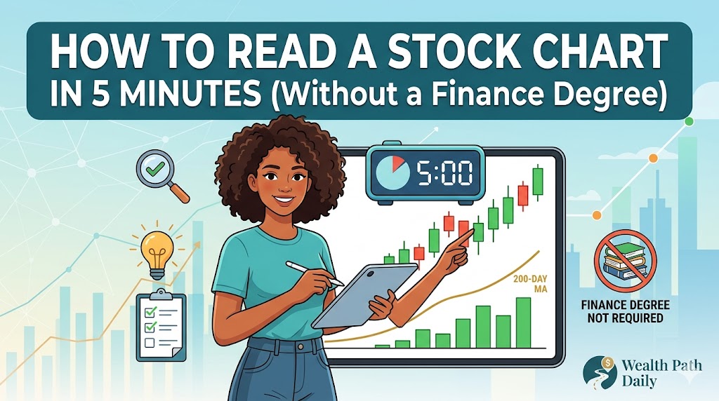
If you are ready to stop feeling intimidated by the stock market, here is your definitive, jargon-free guide to reading a stock chart in under five minutes.
The Anatomy of a Stock Chart: The Basics
Before we dive into the advanced indicators, let’s look at the foundational elements of every stock chart.
The X and Y Axes
Every stock chart is built on a simple grid.
- The Vertical Axis (Y-Axis): This represents the Price of the stock. It shows you exactly how much one share costs.
- The Horizontal Axis (X-Axis): This represents Time. Depending on your settings, this could span a single day, a month, a year, or even a decade.
Golden Rule: Always check your time horizon first. A stock might look like it is crashing on a 1-day chart, but zooming out to a 1-year chart might reveal it is actually in a massive, steady uptrend.
Line Charts vs. Candlestick Charts
If you are using a standard investing app, you are probably looking at a Line Chart. This simply plots the closing price of the stock each day and connects the dots. While simple, it leaves out a lot of crucial information.
To really understand what is happening, you need to switch your view to a Candlestick Chart. This is the absolute standard for investors worldwide.
Decoding the Candlestick (Your Most Important Skill)
A candlestick chart gets its name because the data points look like little rectangular candles with wicks sticking out of the top and bottom. While it looks complex, each candle tells a complete, four-part story about the stock’s price during a specific timeframe (like a single day).
Here is how to read a single candle:
- The Color: A green (or sometimes white) candle means the stock’s price went up that day (bullish). A red (or sometimes black) candle means the price went down (bearish).
- The Body (The thick rectangular part): The top and bottom edges of the thick body represent the Open price (when the market opened at 9:30 AM) and the Close price (when the market closed at 4:00 PM). On a green candle, the close is at the top. On a red candle, the close is at the bottom.
- The Wicks (The thin lines sticking out): Also known as “shadows,” these thin lines show the absolute highest and absolute lowest prices the stock reached during that trading day, even if it didn’t stay there.
By looking at the size of the body and the length of the wicks, you can instantly see the “battle” between buyers and sellers. A long green body with short wicks means buyers were completely in control all day.
Two Key Indicators to Watch (Without Getting Overwhelmed)
Professional day traders use dozens of mathematical overlays on their charts, but for long-term investors, you only really need to understand two basic indicators.
1. Trading Volume
Usually displayed as a row of vertical bars at the very bottom of the chart, Volume shows exactly how many shares were bought and sold during that period.
Volume is the ultimate lie detector of the stock market. It tells you the conviction behind a price move. If a stock shoots up in price, but the volume bar is very small, it means very few people are actually trading it—the move might be a fluke. However, if a stock price surges upward accompanied by a massive, towering volume bar, it means institutional money (mutual funds, banks) is buying in. That is a strong signal.
2. Moving Averages
A Moving Average (MA) is a single, smooth line overlaid on the chart that averages out the stock’s price over a specific number of days. It filters out the daily “noise” and helps you see the true trend.
- The 50-Day Moving Average: Shows the short-term trend.
- The 200-Day Moving Average: Shows the long-term trend.
When a stock’s current price is sitting above its 200-day moving average, it is generally considered to be in a healthy, long-term uptrend. If it falls below that line, it is a warning sign that the overall momentum has shifted downward.
Your 5-Minute Chart Reading Routine
Ready to put this into practice? The next time you research a stock, run it through this simple 5-minute actionable checklist:
- Zoom Out (1 Minute): Switch the chart timeline to 1 Year or 5 Years. Is the overall line moving from the bottom-left to the top-right? If not, proceed with caution.
- Read the Candles (2 Minutes): Switch to a 3-Month candlestick view. Are there mostly thick green candles (buyers in control) or long red candles (sellers dumping the stock)?
- Check the Conviction (1 Minute): Look at the volume bars at the bottom. Are the recent upward price movements supported by high volume?
- Find the Trendline (1 Minute): Turn on the 200-day moving average. Is the current stock price comfortably above this line, or is it struggling to stay afloat below it?
Conclusion
Reading a stock chart does not have to be an intimidating exercise reserved for Wall Street elites. By understanding the simple story a candlestick tells, keeping an eye on trading volume, and using moving averages to spot the long-term trend, you can make vastly more informed investment decisions.
Remember, a stock chart cannot predict the future with 100% certainty, but it is an incredibly powerful tool for understanding the present. Stop staring blindly at the ticker price, start looking at the actual chart, and take control of your financial journey today.
Stay tuned to Wealth Path Daily for more actionable personal finance strategies designed to help you build a richer, more intentional life.